 |
| 102,000 worlds biggest cities, plotted as dots. Applied mild edge glow filter for kicks. |
Without going into any sort of detail, the algorithm basically takes a set of spatial data points (coordinates + other data attributes) and creates a representation that:
- allows visualization of data attributes in the spatial context
- provides exploratory navigation
- does so very fast ( pre-process: O(N log N), interaction: O(1) )
Well, if you just took those 102k points and plotted them as small dots to a 2D plane, you would get something like the plot above.
It might be an interesting picture, but it is clear that you can not visualize the individual cities, let alone their labels this way, at least on this level of abstraction or "zoom". Sure, things would appear cleaner once you zoomed all the way to a particular city. The thing is, how do you know where to zoom? With this example data, you know approximately where to zoom because you know the data. With Gridder, I want to visualize data that you have never seen hence I need to provide a way to explore the data and give the user as much useful information as I can, on multiple levels of abstraction or resolution.
Let's see an example of Gridder output for the above data at the given resolution combined with the satellite data visualization:
 |
| Gridder output with city attributes (see bellow) |
Here we notice a couple of things:
- general spatial characteristics (shape) of the data is preserved, especially for important (big) clusters
- points are "normalized" to a relatively small number of rows and columns to reduce clutter and simplify interaction
- grid intersections represent clusters of data, where for each cluster we see:
- the name of the representing city (biggest in the cluster population wise)
- population of the representing city (green circle)
- total number of cities in the cluster (yellow circle)
Some more examples on this dataset (different resolutions and grid sizes):
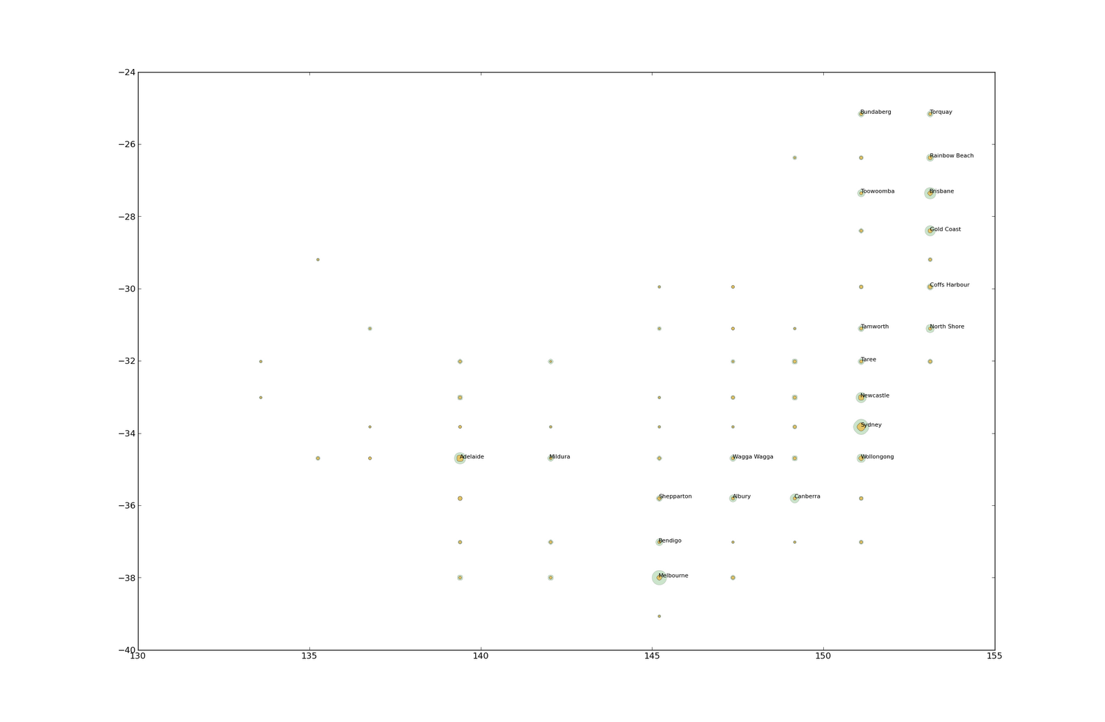 |
| The coast of Australia, New South Wales and Sydney (16x16) |
 |
| Something more complex, lots of big cities The coast of China and Taiwan (16x16) |
 |
| World view at 8x8 |
- The cluster of Europe is labeled Istanbul. I went to wikipedia and realized that in fact Istanbul is the 3rd most populated city in the world and hence takes the place of the representative.
- The cluster of US southeast is labeled Havana. It is actually a tad bigger then Huston and a lot bigger than Atalanta and other big cities in this area.
- The European yellow dot is huge, it actually is the biggest one on the map. We have a lot more cities per square km than say USA (I am too lazy to confirm with some independent data). Note that my data only contains cities above 1000 inhabitants, if we took even smaller settlements Europe might be even further ahead.
Last plot, with an overlay of the actual data points:
 |
| A part of Western Europe Here the overlay lets you observe the difference between the actual coordinates and Gridder approximation |
The source of the city data:
ReplyDeletehttp://download.geonames.org/export/dump/